Rose Bay
Project Scope: Interior and Exterior
“Bring the outside in ”
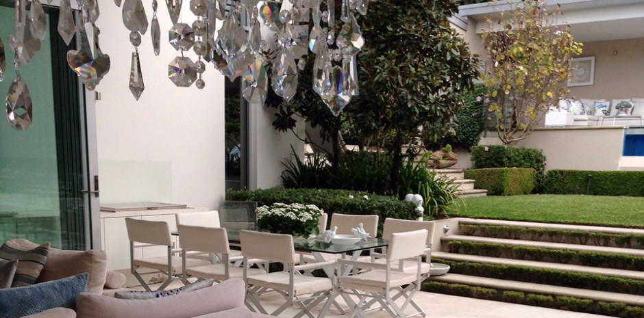
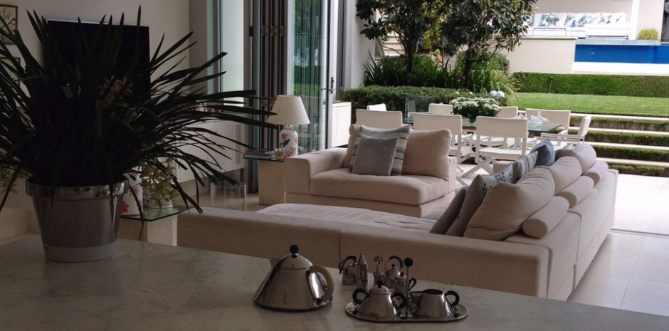
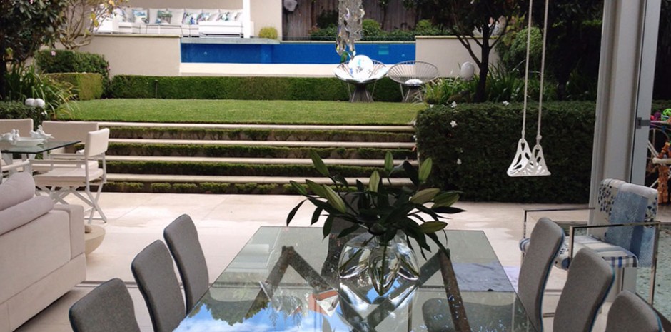
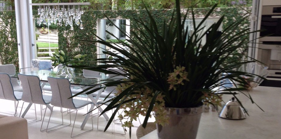
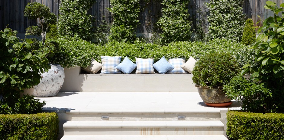
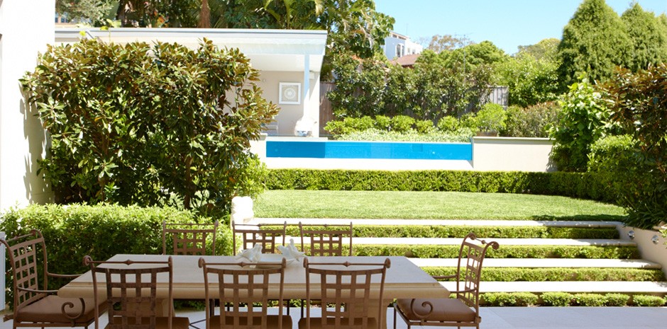
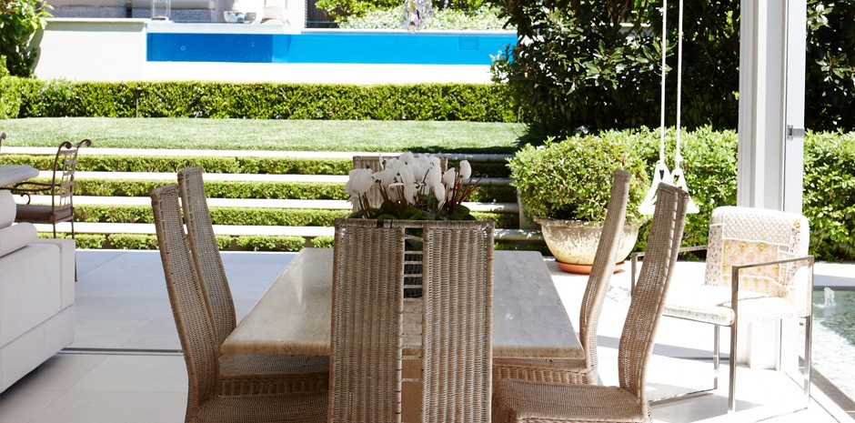
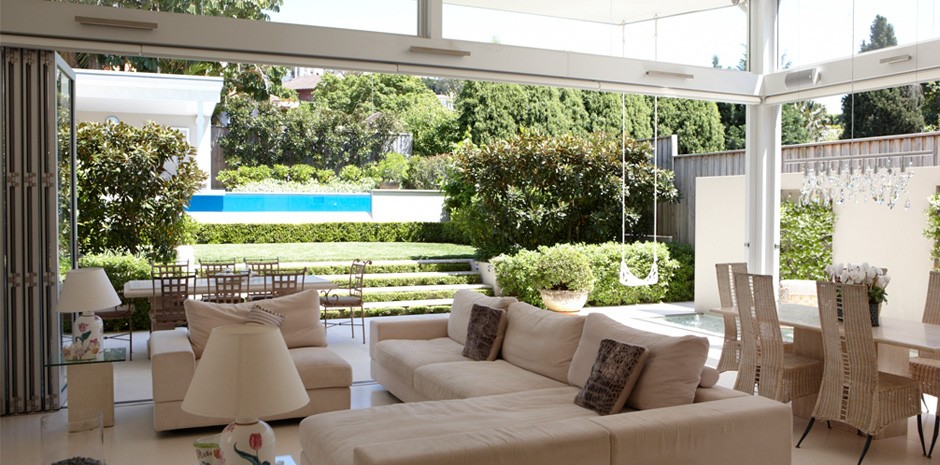
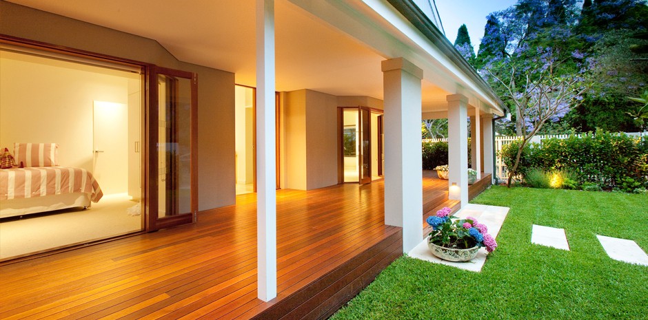
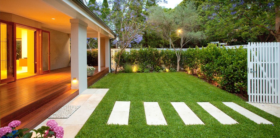
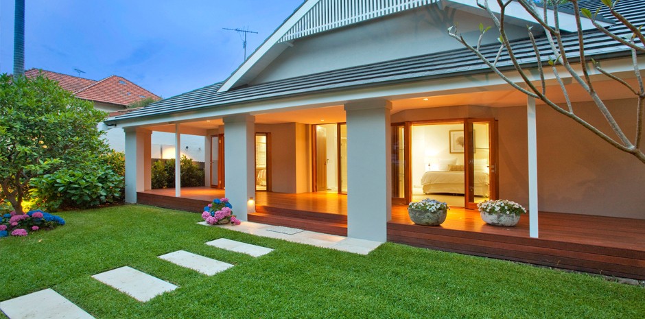
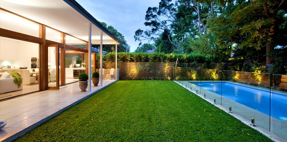
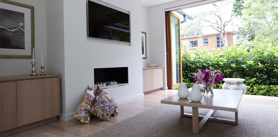
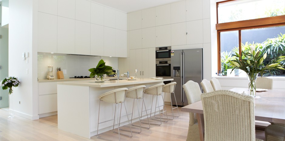
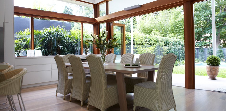
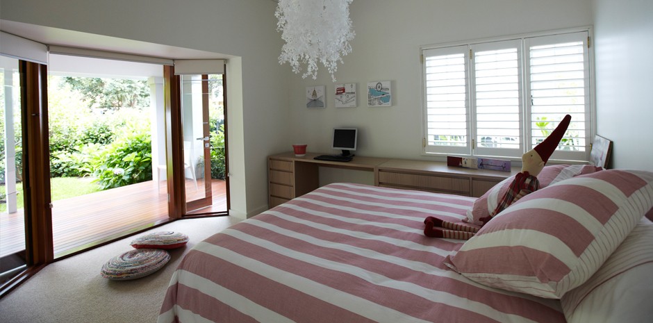
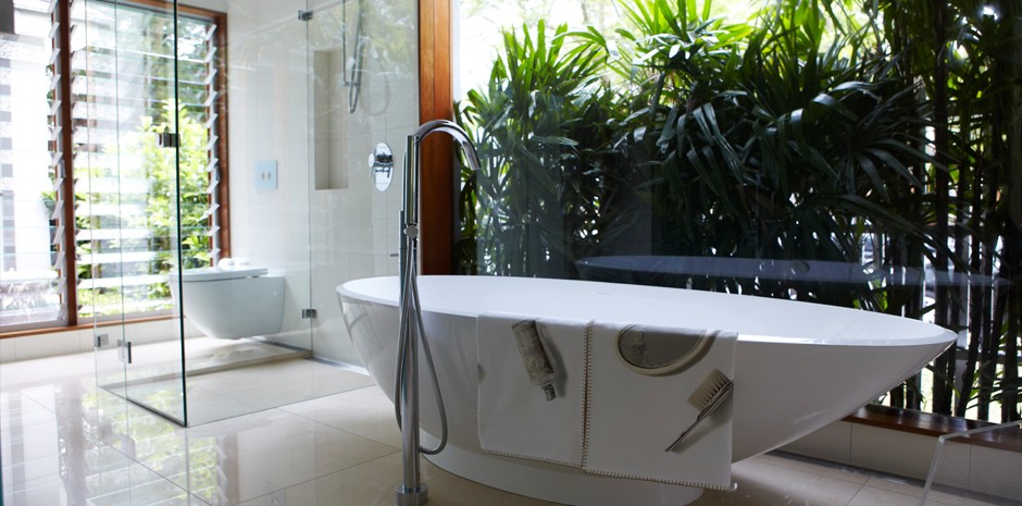
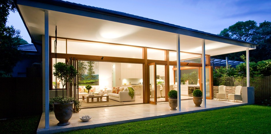
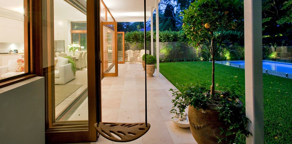
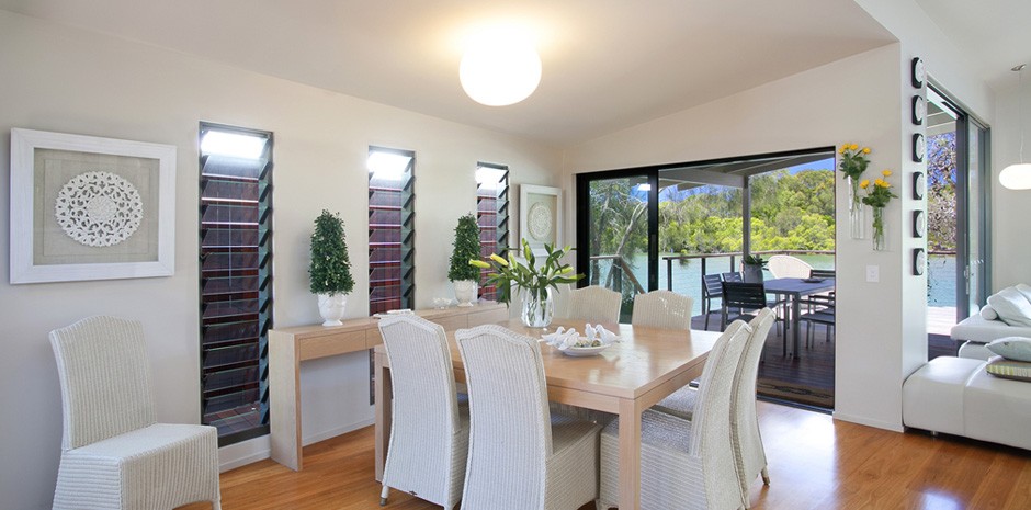
In this project the aim was to bring the outside in. Make the whole house flow so that you are never quite sure if you are inside or out.
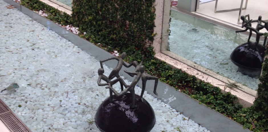
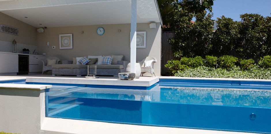
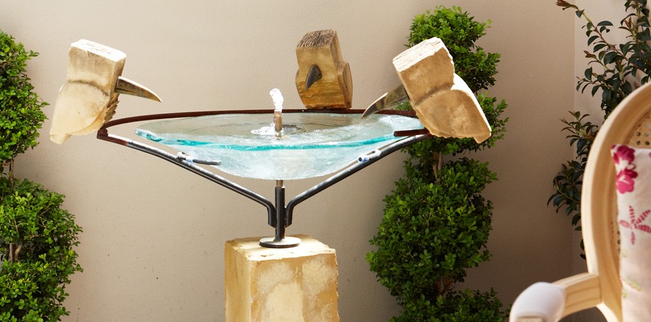
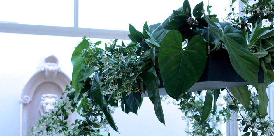
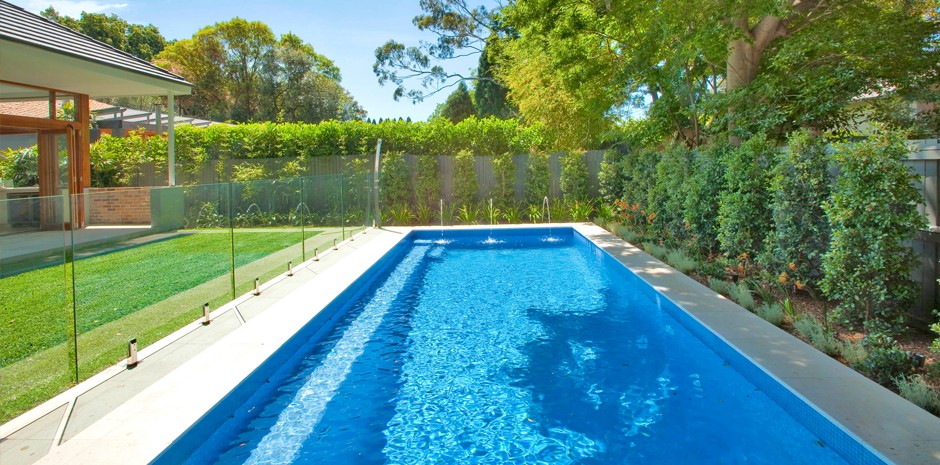
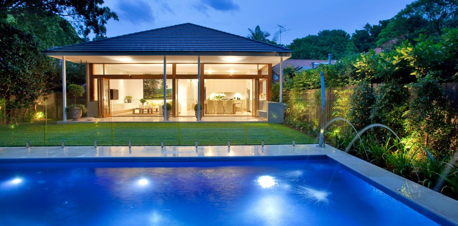
In every section of this stunning home we have made a special area of either garden or water. A massive “indoor Pond” with glass bubblers is an amazing feature-which leads you out into the garden with the glass pool face shiny with a blue Crystal. The incredible blue water can be seen from all angles of the house and garden.
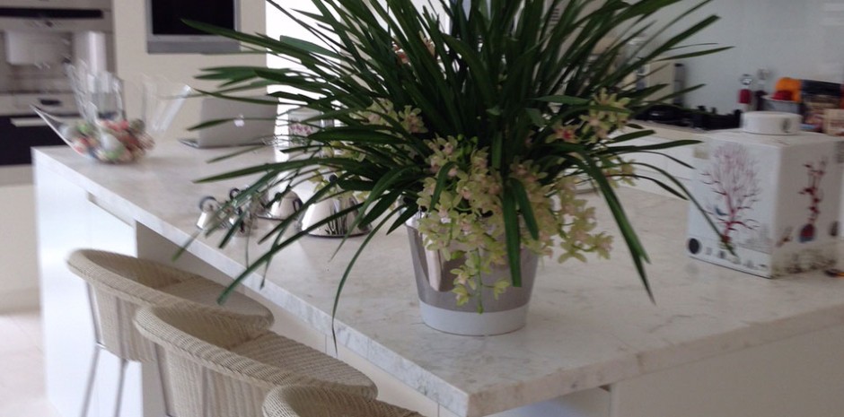
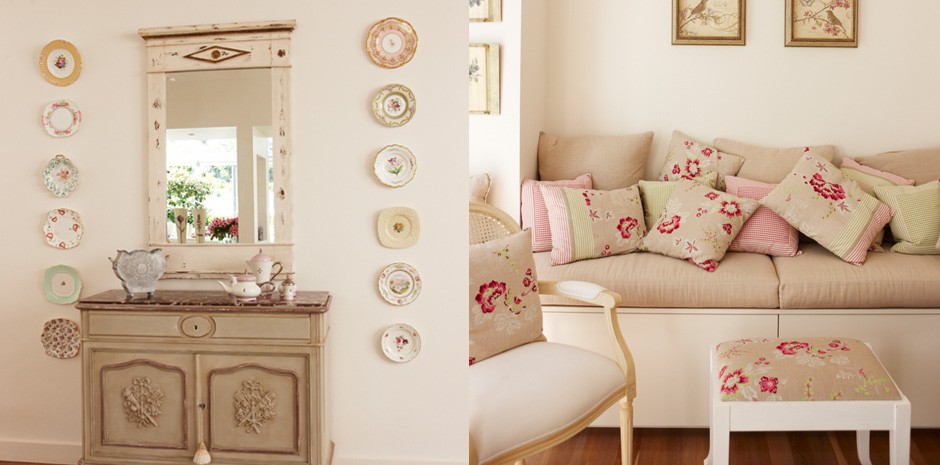
Each room is also a different style but blends in wonderfully together — very eclectic.
Keep posted with this home as we have been asked to now renovate the front facade and put an incredible indoor /outdoor master bedroom retreat in early 2011.
Rose Bay 02
Beautiful Spaces – Inside and Out, designed this home to incorporate the beautiful street scape and wonderful Rose Bay harbour-side promenade around the corner.
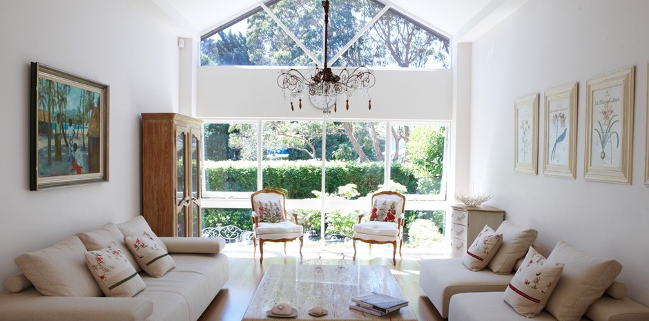
The focus was on creating luxurious and tranquil spaces with abundance of natural light, soaring ceilings and seamless indoor-outdoor entertaining areas.
Creating a central hallway, we built a six metre high glass roof to bring light to every room throughout the house, while using glass highlights above each bedroom door to let this incredible light in.
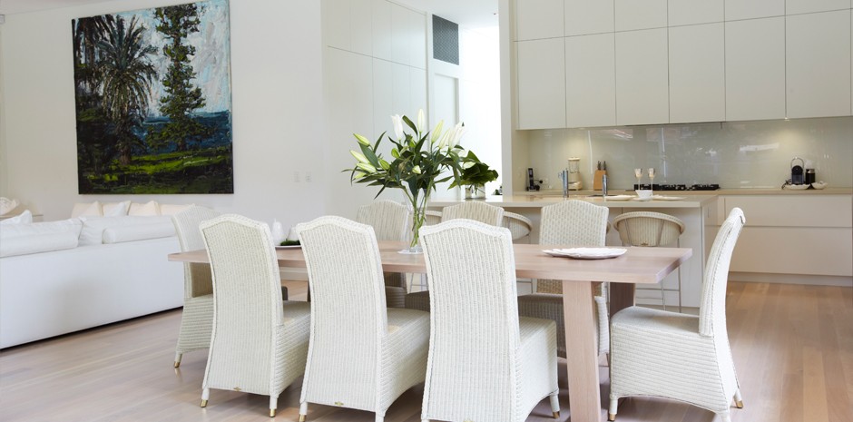
The colours Allyson wanted to see throughout were the blue of the water, the greens of the gardens and the white clean fresh finishes, with a stunning American oak stained floor and stunning American oak furniture made by her wonderful furniture designer, Gary Hamer.
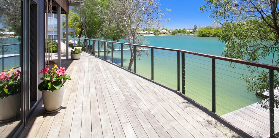
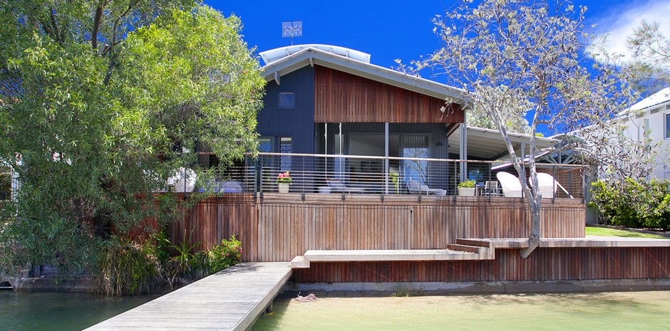
Noosa
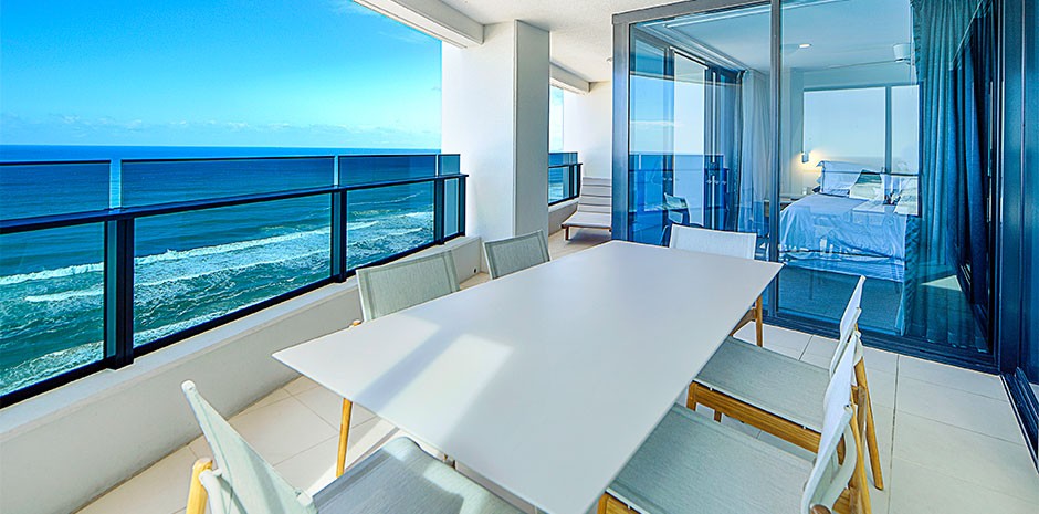
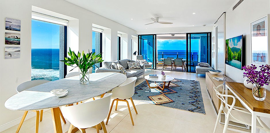
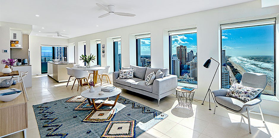
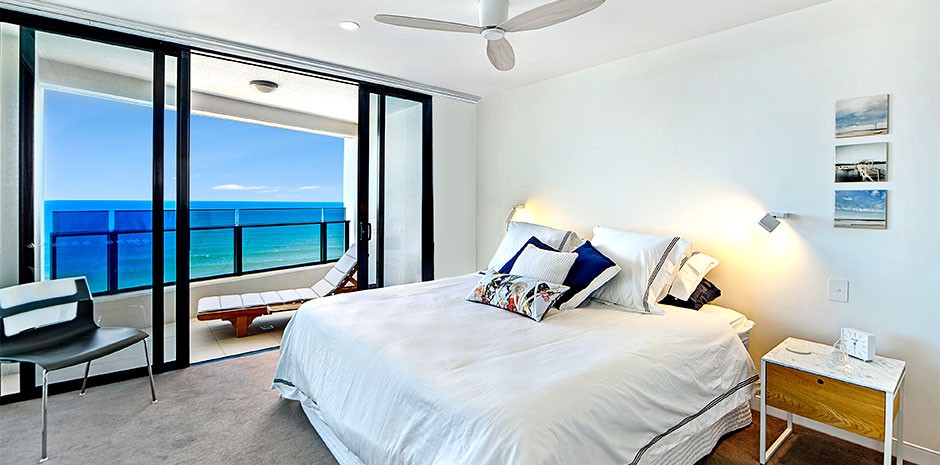
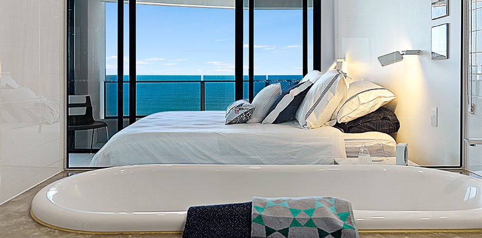
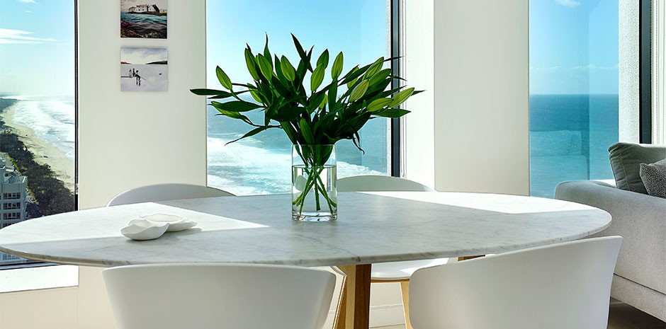
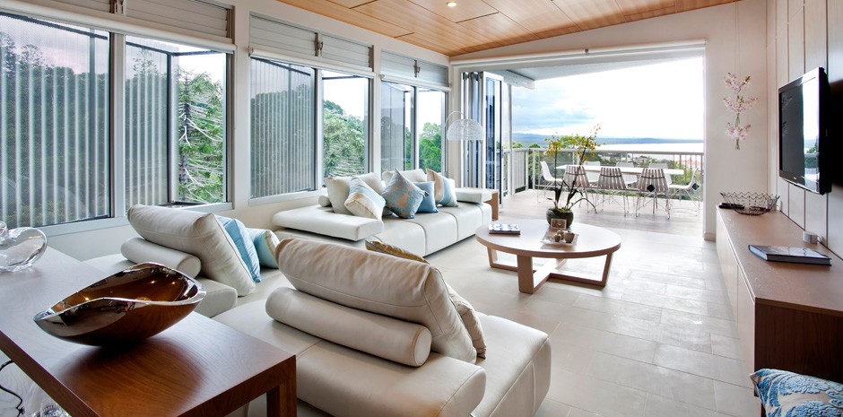
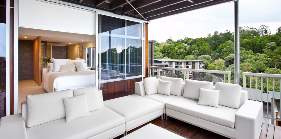
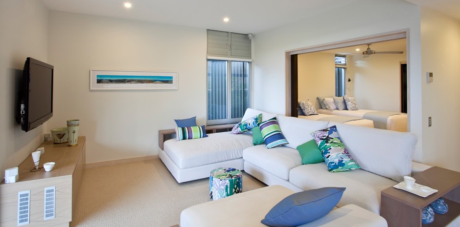
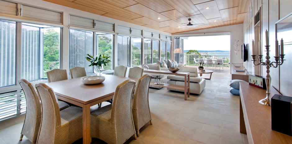
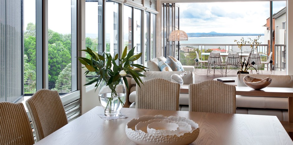
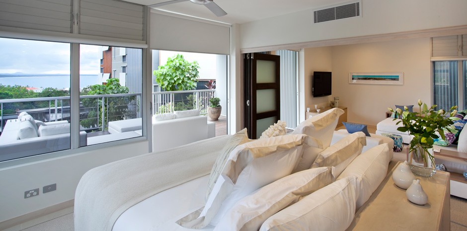
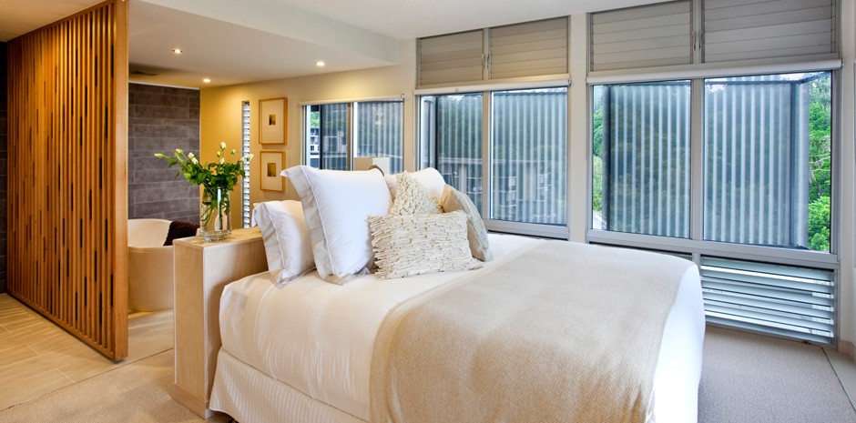
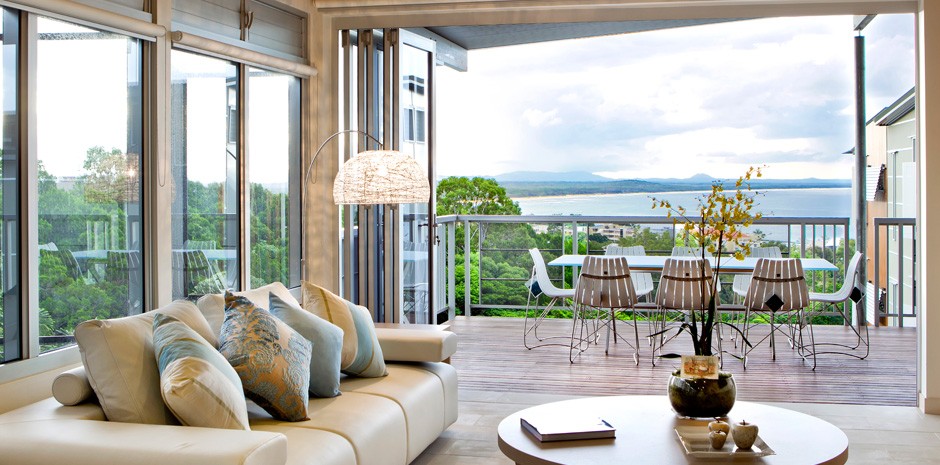
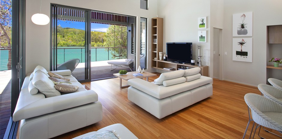
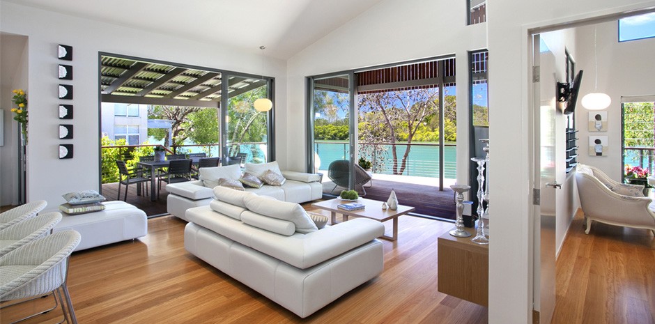
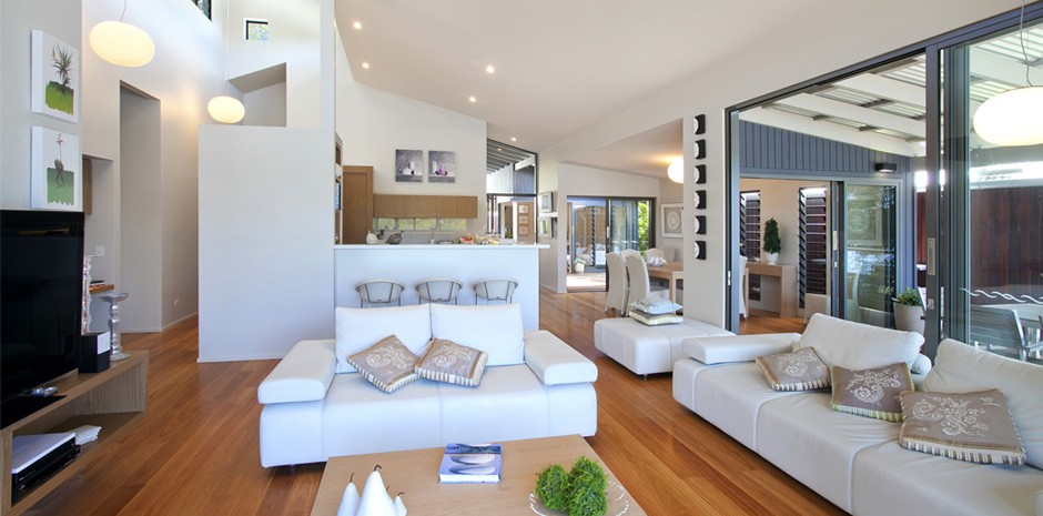
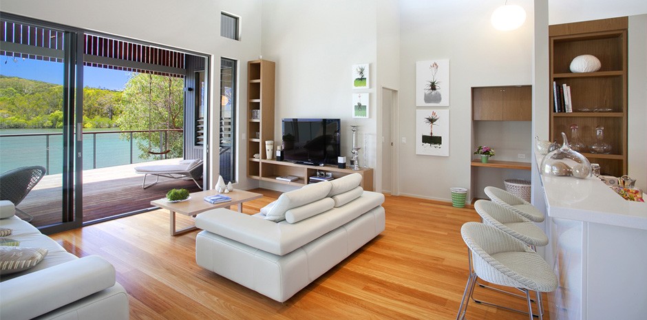
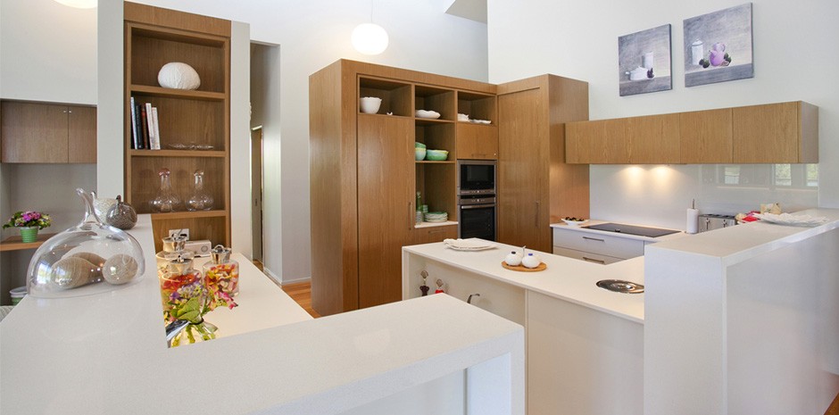
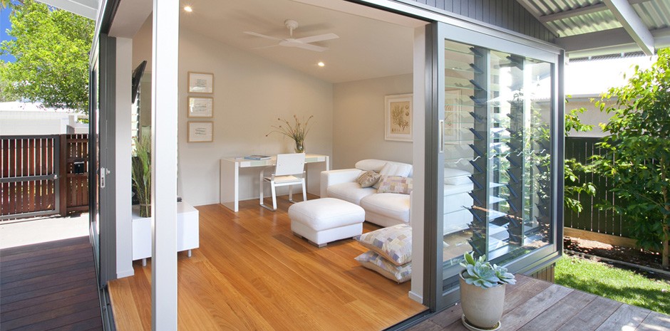
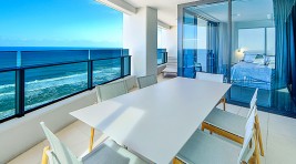
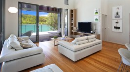
Perched high on Noosa Hill, this apartment offers some of the most breathtaking hinterland, river and ocean glimpses of picturesque Noosa.
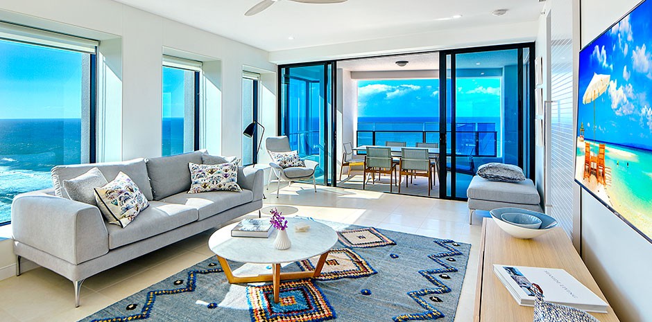
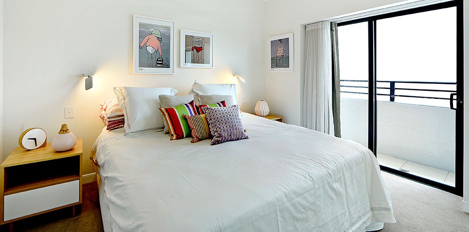
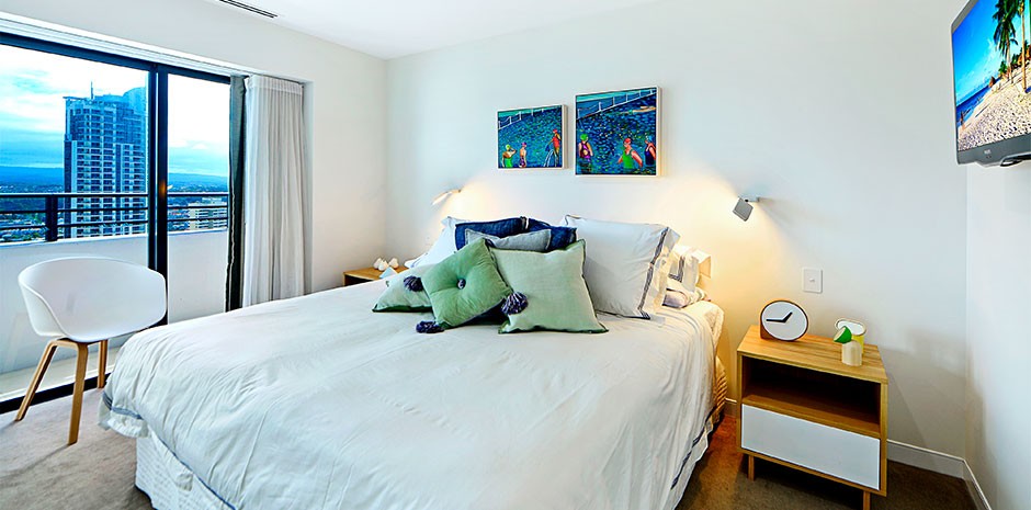
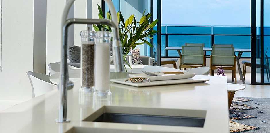
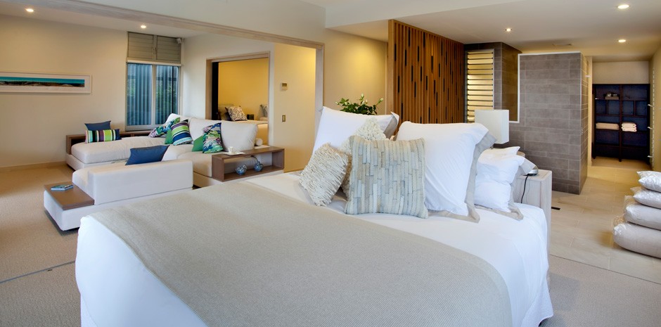
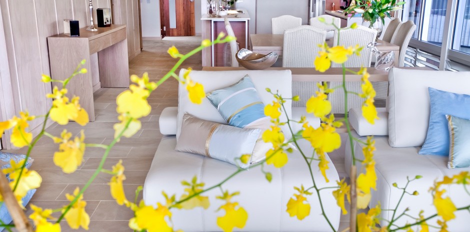
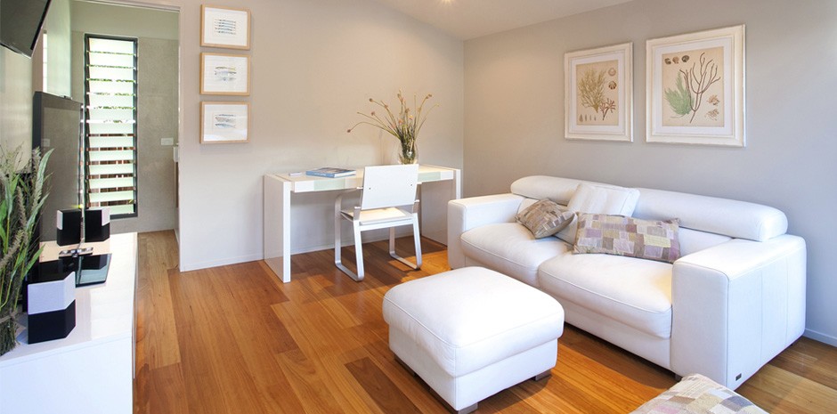
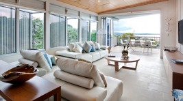
This haven of tranquility has been built to blend into the perfect paradise in sub-tropical Queensland. The elegant tones and textures combined with the beach lifestyle theme create the ultimate in indulgence amidst a relaxed yet decadent environment.
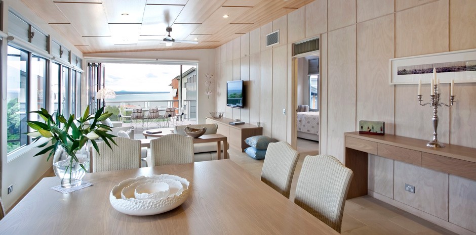
The client allowed me to take full reins on the design of this space and wanted the rooms to flow from one to the other.
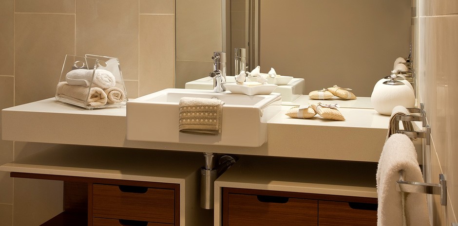
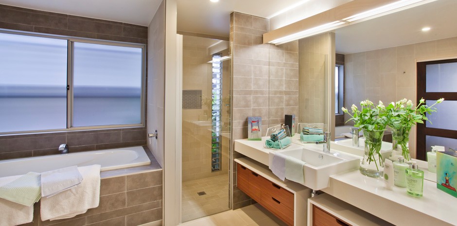
The design of this space in conjunction with simple colours and a soft palette created a stunning and peaceful ambiance with the colours of the sand and ocean.
I was very much inspired by the surroundings in which the apartment was based. The different colours, textures and shapes of the environment inspired me to integrate similar feelings and aesthetics into the overall design.
The Sunshine Coast certainly lives up to its reputation and I endeavored to create a space which not only was aesthetically pleasing, but a living space which allowed the client to really take full advantage of the beautiful paradise in which they lived. Through open living spaces, bi-folding doors and stunning glass, the client now feels like they’re actually part of that paradise.
As an interior designer , this apartment and the location was an absolute wonder to help design.
Paddington 02
Project Scope: Paddington Kitchen
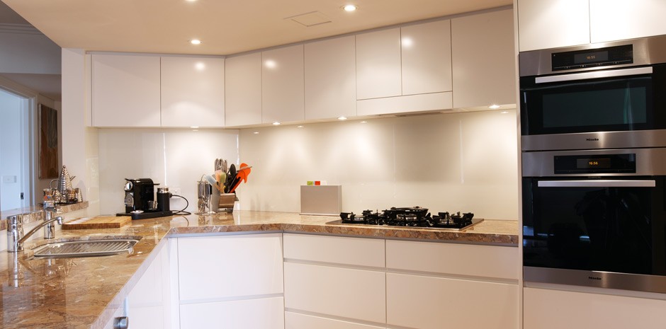
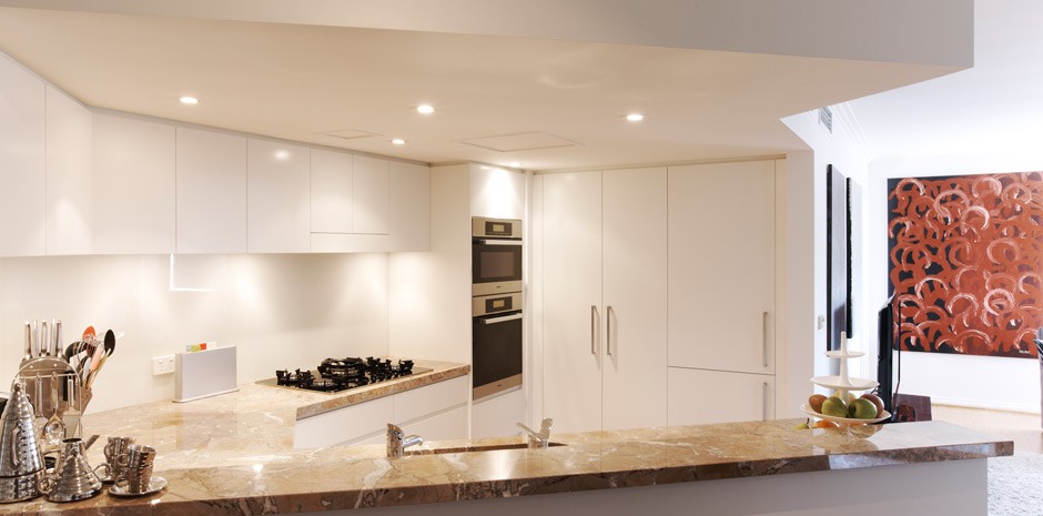
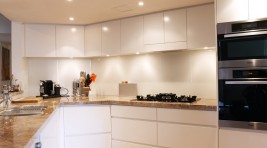
The scope for this project was to “lighten up” and modernise a dark kitchen in this amazing Paddington apartment. The apartment has fabulous skyline views so we had to ensure the kitchen was able to take advantage of this.
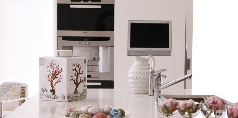
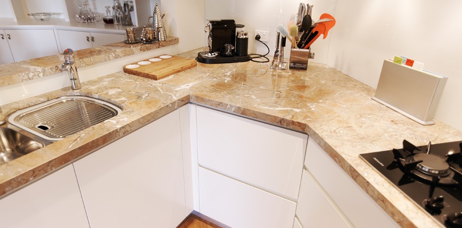
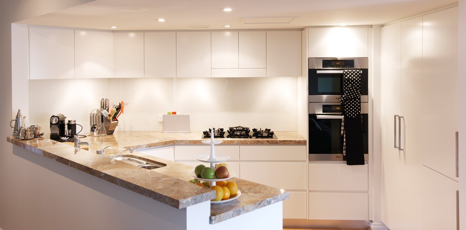
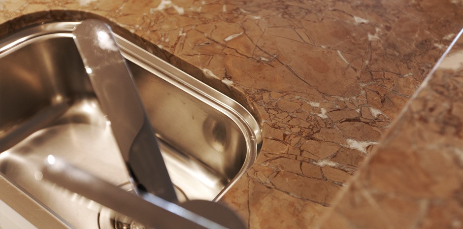
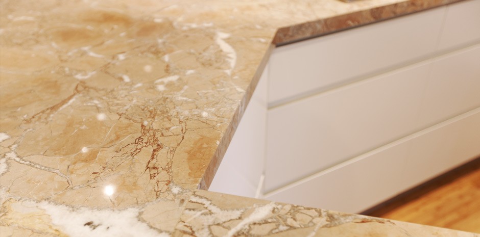
We removed half a wall and created a servery with a beautiful marble top and bench top. We completely rebuilt the kitchen with new modern polyurethane cupboards with shark nose doors, therefore no need for handles except on the pantry and fridge doors. Whisper White by Dulux was used on all the cupboards as well as the glass splash back ,walls and ceiling.
The client was so pleased with the result as it has opened up the whole living and dining area. This beautiful unit is a work in progress as we will be re-doing the carpets and putting in stunning new sleek blinds and painting throughout, so keep watching this space!
Woollahra
Project Scope: Interior and Exterior
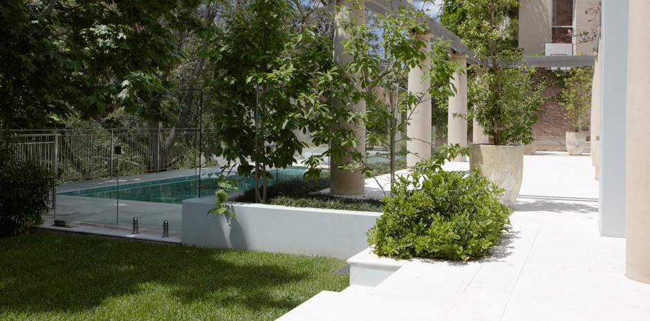
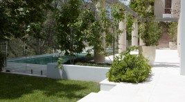
This award winning home is magnificent with views straight onto the park. We wanted the garden and swimming pool to be a prelude to the park views.
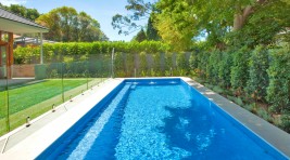
We have created the amazing swimming pool using Bisazza tiles in green and gold blends. The effect is that the pool “shimmers” during the day as the sunlight reflects off the water — at night it’s just as spectacular as the light from the moon provides a completely different effect.
The combined house, garden and park view was a specific concept we used to bring together both the house and natural surroundings.
On the lower level, we chose “Beige Marfil” from Euro Marble for both the internal and external flooring. This is a palish limestone that provides an incredible flow from inside to out.
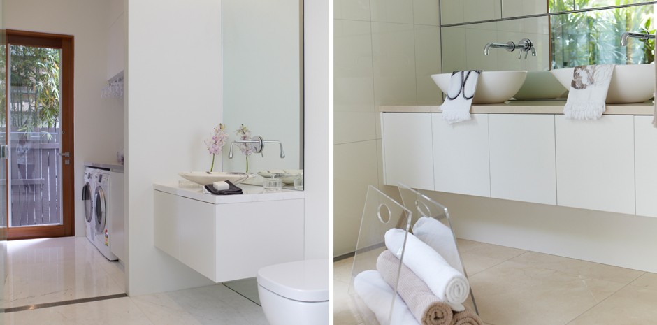
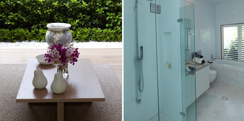
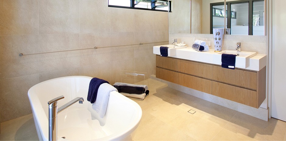
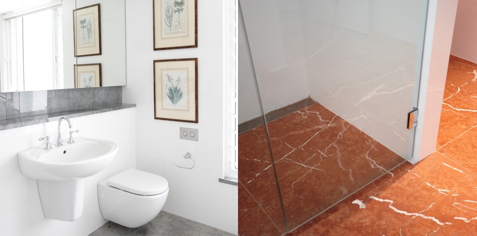
The bathrooms are all individualistic and add a different dimension to the house. The Master being a full marble bathroom using “white Hermes” both on the walls and floor creating a feeling of luxury with large white and grey towels and a view to the beautiful garden and park back drop.
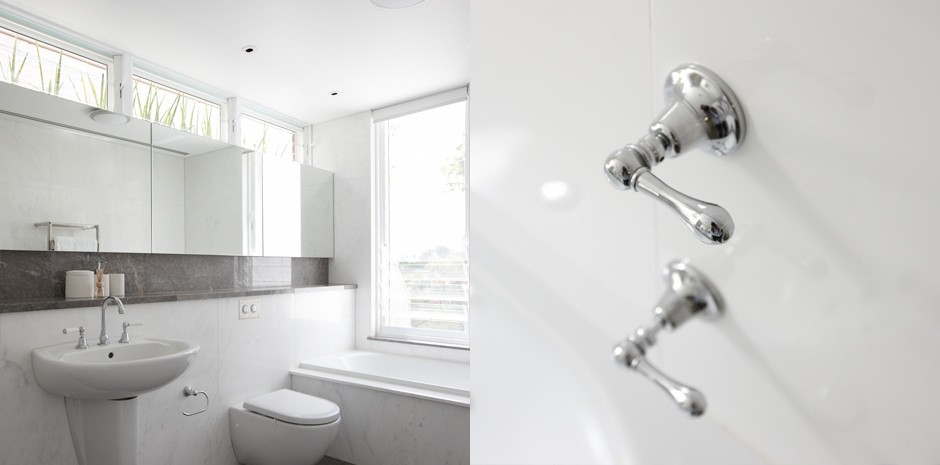
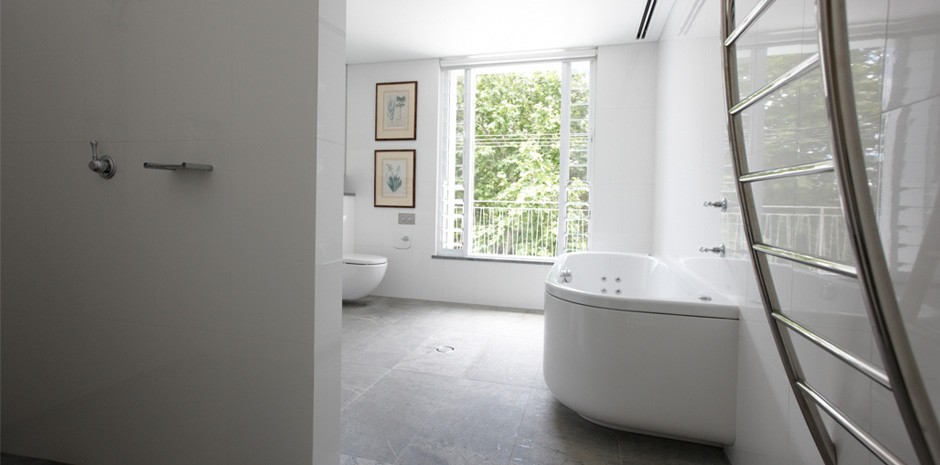
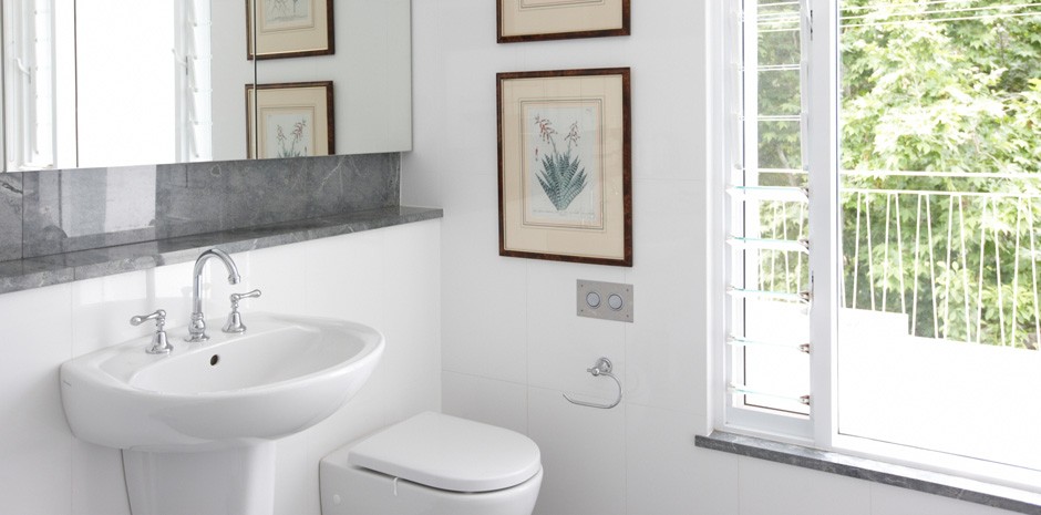
In the boys bathrooms we used large white tiles on the walls and a grey tile for the floor surfaces. Together with stainless steel towel rails and towel hangers, this provides a more masculine feel.
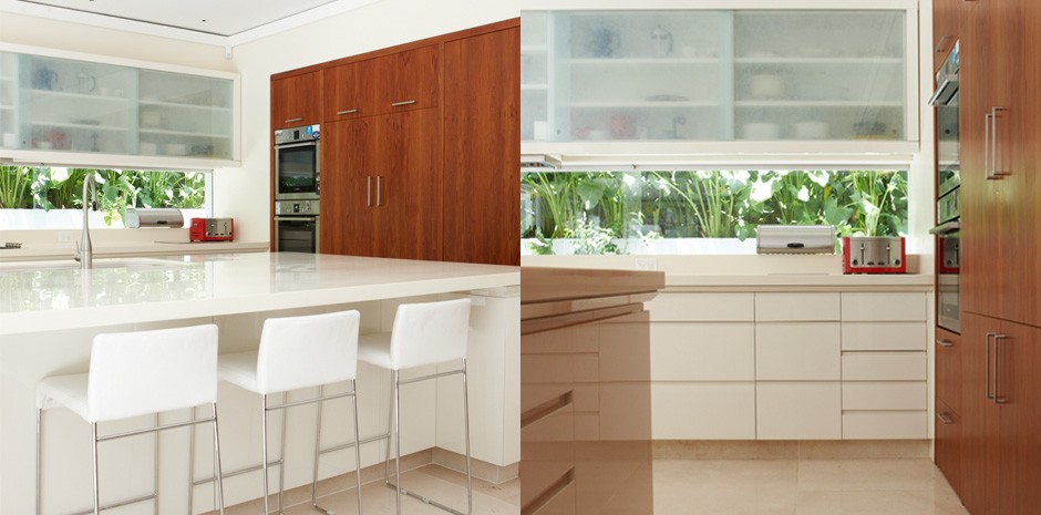
For the kitchen, the client wanted timber cabinets while maintaining a modern feel. We incorporated a marble bench top with Caesar stone preparation areas and timber pantry. The polyurethane cupboard made in the same colour as the wall, made it all blend together magnificently.
Double Bay
Project Scope: Interior (Bathrooms & Kitchen)
This client has a young family and the owners wanted to make the family room and kitchen the focal point of the house leading out into the courtyard and garden.
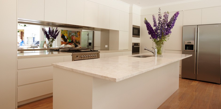
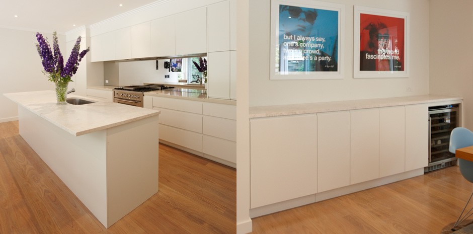
The sleek lines in the kitchen are very modern and simple. There is plenty of storage and we also incorporated a desk into one of the end cupboards with a chair for this busy mum. The mirror splash back enables mum to watch the children while facing the oven and hotplates. This also gives the impression of the area being more spacious.
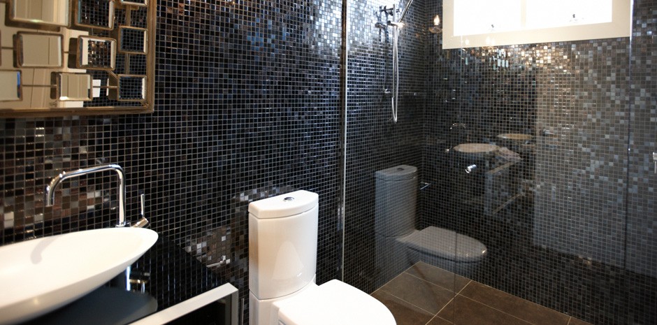
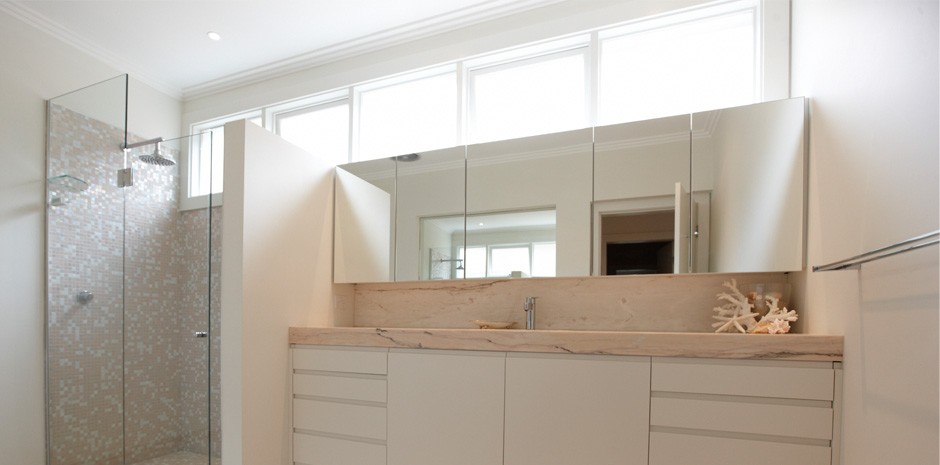
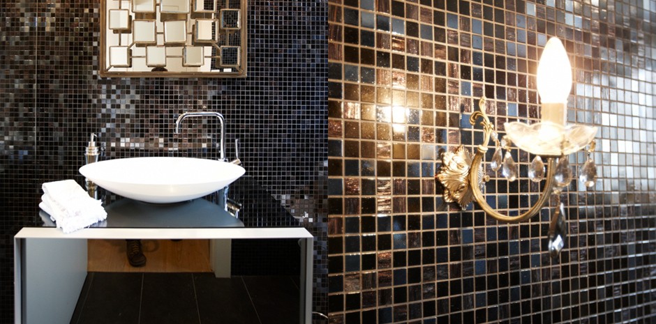
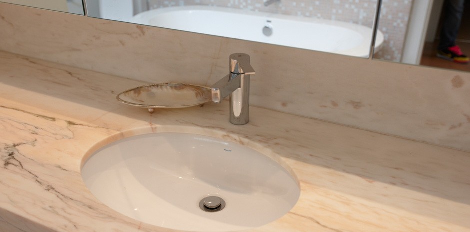
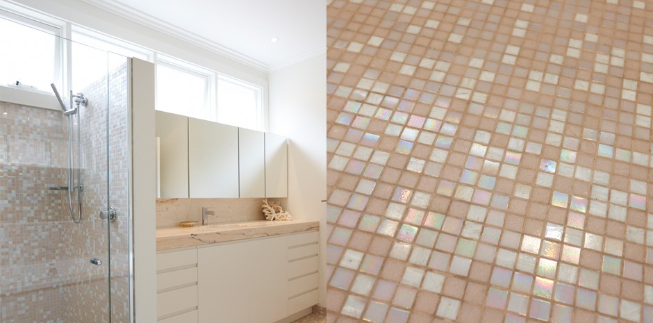
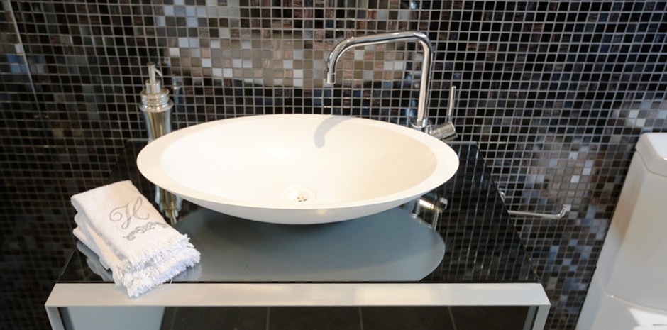
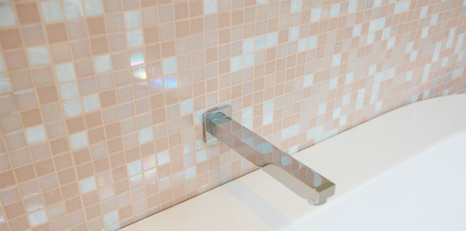
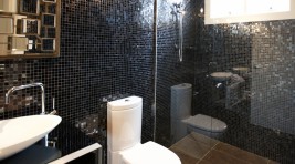
Both bathrooms have been tiled with stunning Bisazza mosaic tiles. The first bathroom in black blends to create a sexy and striking room. A striking black chandelier is the lighting source for this room. Contrastingly, for the second bathroom we used soft pinkish marble for the bench top, supplied Euro Marble and then pink and white blends again of Bisazza mosaics. This is the “Pretty side” of the females coming out in the house. This room is completed with the white bath and other fabulous pieces.
Dover Heights
Project Scope: Interior (Bathroom & Kitchen)
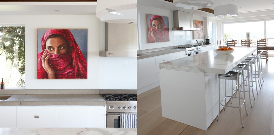
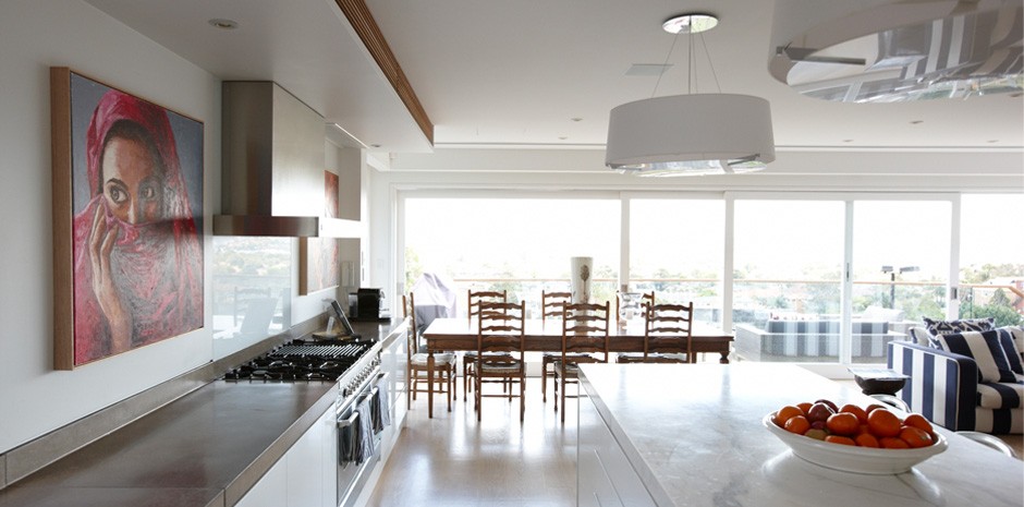
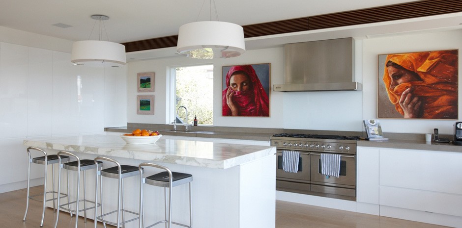
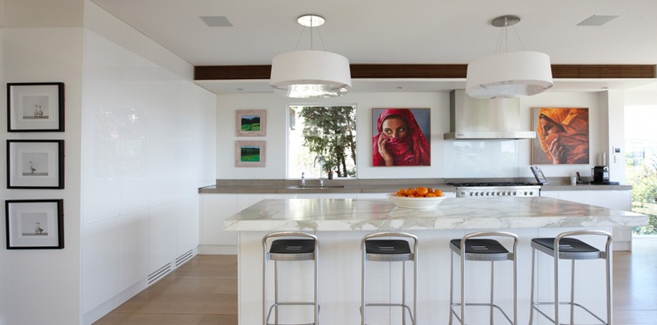
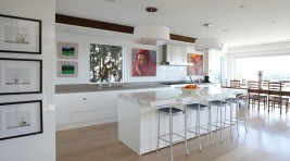
The clients brief for this kitchen was to establish an open and stylish kitchen which would complement the amazing views.
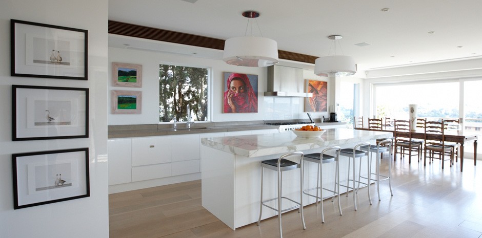
The bench top is “Calcutta Marble” and is the focal point of the kitchen. The cabinetry has been designed with sleek and stylish lines. The bold painting of the walls adds the splash and wow factor to this amazing kitchen. This kitchen is a genuine masterpiece!
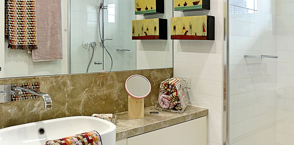
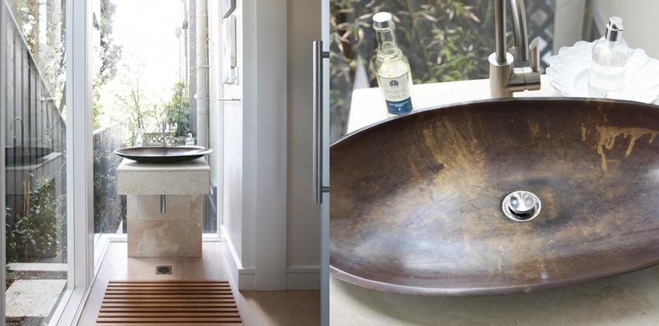
For the guest bathroom, we decided to use as much glass and elegant pieces as we could, given that it was quite a small room. This enabled harbour views to be seen from the vanity and sink, again giving the effect of a larger room.


